Redesigning AI Training Platform

As the sole product designer, I solved the key usability issues and revamped the visual style by re-imagining what it’s like for Clinc's users to train AI. The new design reduced task times by 68% and improved users’ subjective satisfaction by 139%.

new overview page

Background

AI training platform

Clinc's AI training platform helps enginners to build unique conversational experiences for their products with our comprehensive AI technology. Our competitive advantage over the competitors such as Dialogflow (API.AI) and Chatfuel is the ability to empower users to talk in an unconstrained way.

Problem Space

With faster launch of MVP comes greater design challenges

Due to time constraints, our enginners had to quickly ship MVP with the compromise of UX. However, after I did some quick usability testings, I discovered some horrendous usability issues and created two personas:

Users have no idea what each page is doing and what they need to do.

    Power User

  • Inefficiency of Use
    Power users have to constantly shift between pages to search among the mixed data.
  • Low Visibility of System Status
    Power users mess everything up easily because they can easily lose track of each individual training progress.

    Non-power User

  • Poor Mental Model of Competency
    Non-power users have no idea what comprise a competency and what key info they need to gather.
  • Fuzzy Training Process
    Non-power users are struggling with what to do next.

Now, here come the design challenges:

  • How might we communicate the training process to people?
  • How might we empower users to do training efficiently?
  • How might we inform users of system states?

Fast Iterations

Through an interactive design process, I was quickly moving between paper and digital prototyping, testing prototypes with users, and getting feedback from my mentor and AI engineers. From each iteration, I learned something valuable. Some helped me make small usability improvements, some helped me make major changes in my design direction.

Initial iterations for a clear training process

After a few brainstorming sessions, I experimented with all different ways of walking users through training process: steppers, a training guide section, tips, navigation bar, training guide page…

Initial prototypes explored ways to communicate a clear training process.

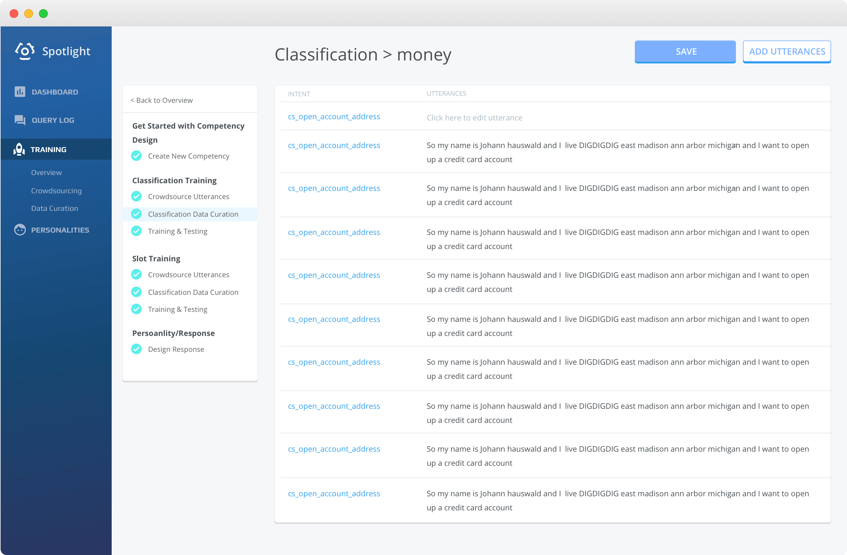
I settled down with creating a training guide page with work area because users can walk through the iterative training process without burden of switching pages. It was unclear, though, what was the best way to design the training guide. I experimented with a few options including:

Prototypes the best way to design the training guide.
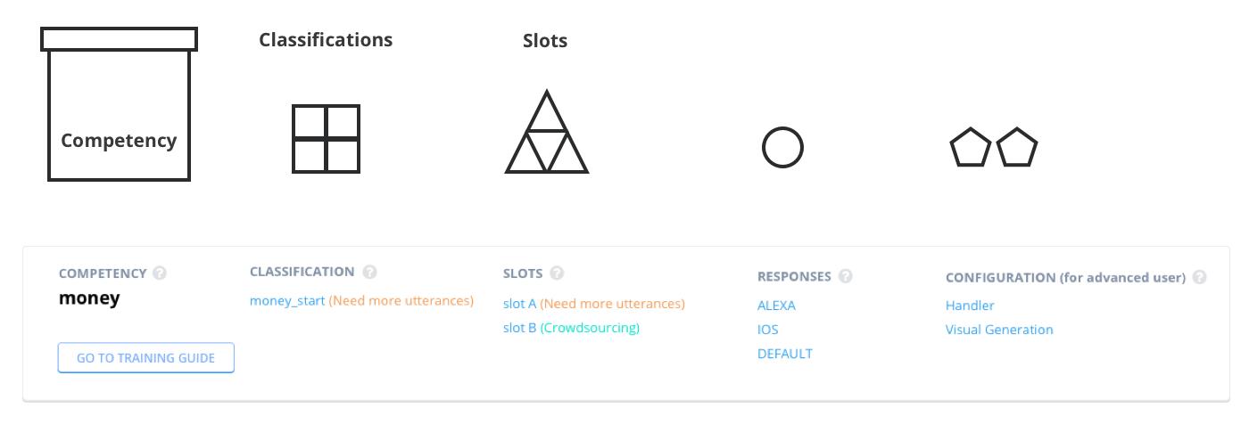
Prototyped the best way to design the training guide.

I went with the second one because this structure is the most common one (e.g. Google Slides or Coursera). Also, the second option has the least visual clutter and effectively leads users to use the training guide.

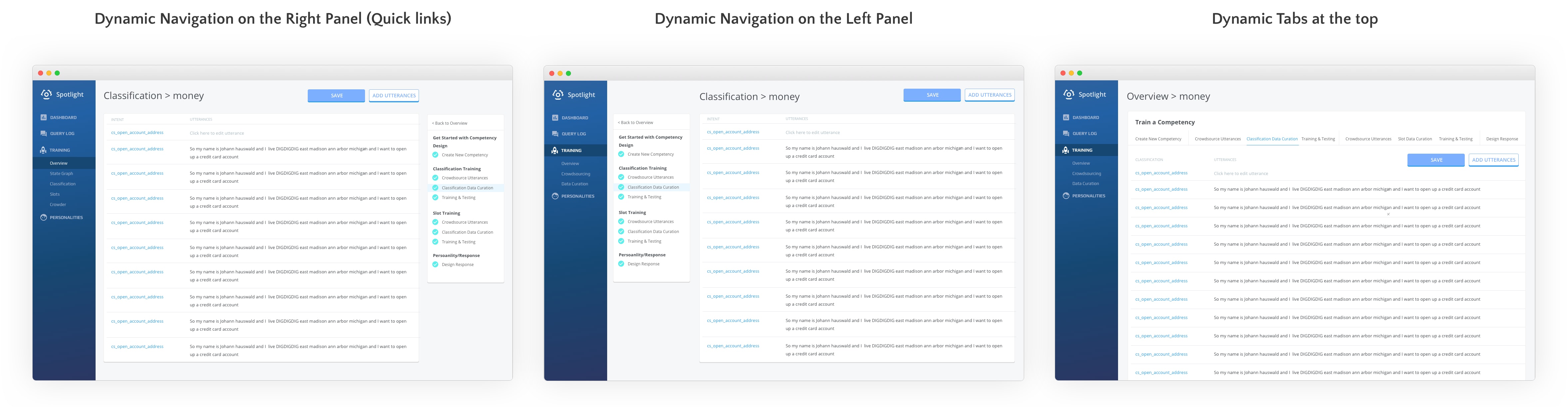
Second-round iterations to improve efficiency of use

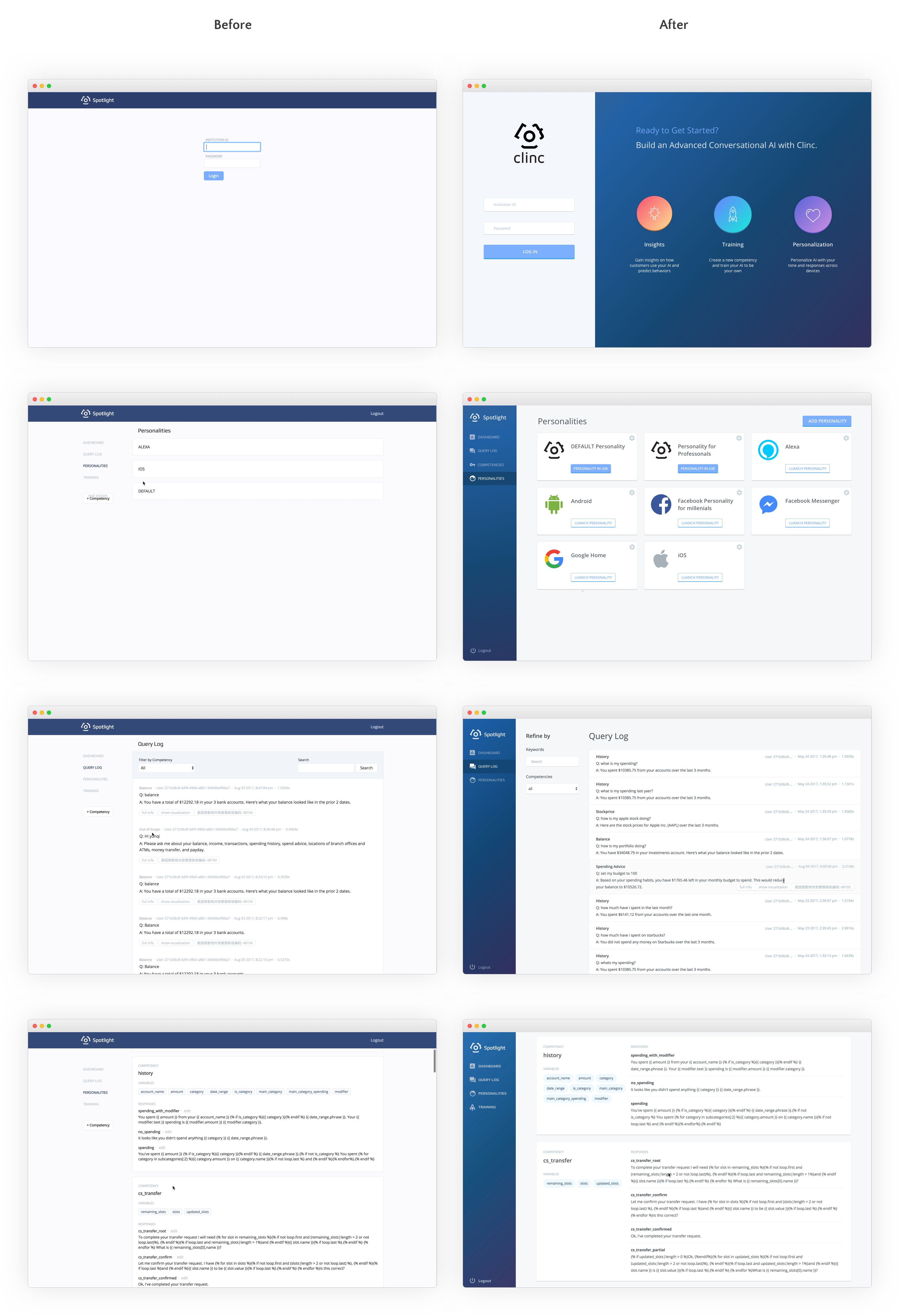
As I was making progress on clear training process, I was also thinking about what would be an easy way for people to gather key info efficiently. This is a tricky task. I spent hours trying to figure this out:

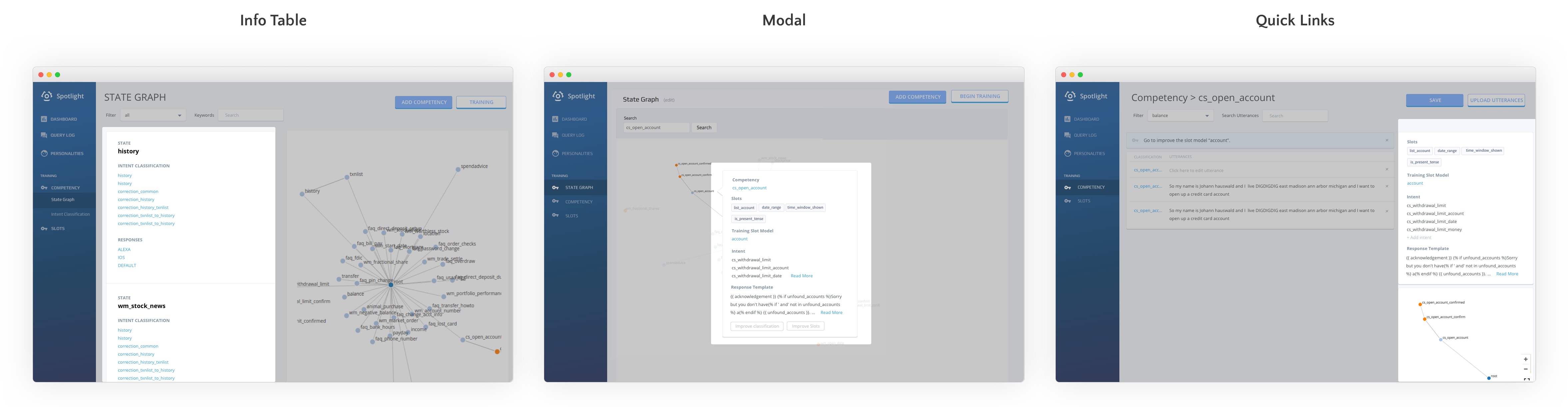
Second-round prototypes explored ways to improve efficiency of use.

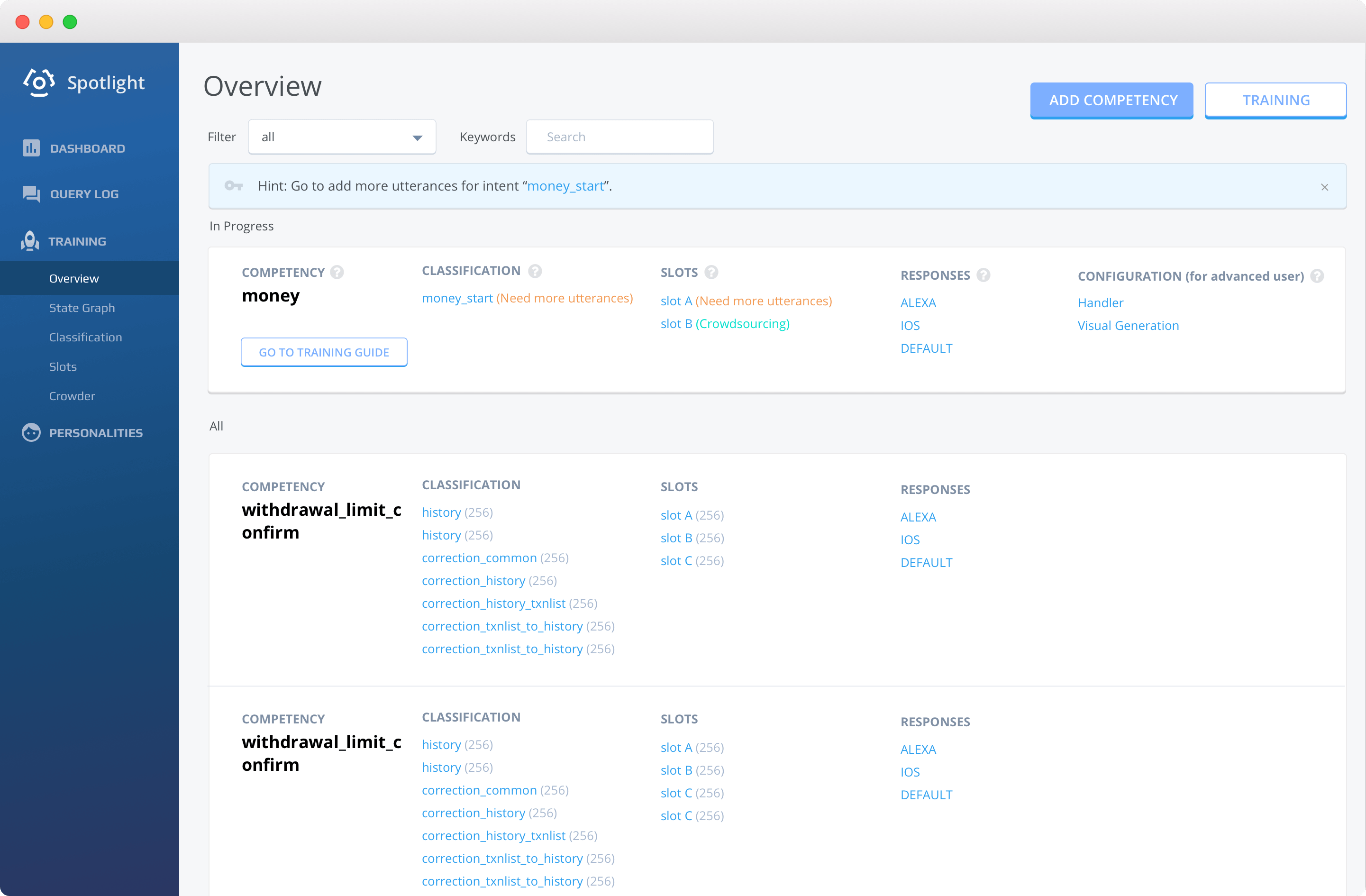
Then I had the outside-the-box idea of offering an overview page. Users can see all the info at a glance without digging deep into the website. A perfect solution!

Design Decisions

Overview Page. Keep everything on track with better information architecture

new overview page
Overview Page. Keep track of the training progress easily.
  1. Use hints to tell users what to do next.
  2. List the in-progress competency at the top.
  3. Inform users of the states of training and what to do next.
  4. Users can see all the related info at a glance without digging deep into the website.

You will be welcomed by an overview page that provides all the information of trainng progress in a single page with the following benefits:

  • Good Mental Model of Competency
    You have a better understanding of what comprise a competency.
  • good mental model of a competency
  • High Efficiency of Use
    You can see all the key info at a glance without digging deep into the website.
  • High Visibility of System Status
    You can have detailed control over training steps. You are informed of the states of training and what to do next.
  • Better Information Architecture
    No matter you are a power user or non-power user, you get all the training materials at hand with clear understanding of training process.
Analogy for the poor information Architecture
Original information architecture.
The materials for a competency are splattered around. Power users have to switch pages to make changes. Non-power users scratch their heads over the fuzzy training process.
Storyboard for the deal user journey
New information architecture.
See how easy it is for power users to work on a specific competency on a page full of all the relevant materials. Non-power users can build a good mental model of the training process and the competency.

Training Page. Train AI at your fingertips without burden of switching pages

training guide with work area
Training Guide with Work Area. Users can train AI at their fingertips.
  1. Users can do the training directly in the work area. No need to jump back and forth between other pages any more.
  2. They can also follow the training guide to see exactly what each step should be.

If you hit the button called "Go to Training Guide", you will land on the training page with the following benefits:

  • Clear Training Process
    You know exactly what to do with the help of training guide.
  • High Efficiency of Use
    You can do the training directly in the work area. No need to jump back and forth between other pages any more. You are also more confident that you are doing changes on the right AI competency.

Visual Style

I also redesigned and coded the website for Clinc so that it best express our brand identity. It's innovative, imaginative, and accessible.

before & after
Before v.s. After.
I worked on Clinc's AI training platform, building a new design system through design and front-end coding.

Login Page. Proactively communicate our product value.

This is an important page, but so much space has been wasted on the original design.

  • Product Value
    I added a call-to-action and created 3 new columns to clearly describe what we do and how we differentiate from others. This supports our brand awareness and customer retention.
  • Blue Gradients
    Regarding color choices, I chose blue gradients. The blue create a professional identity, yet the hues upgrade the perception of the company in a techy way. The gradients of the icons also create an imaginative and accessible aura.
before vs after login page
Login Page. Proactively communicate the value of our technology.

Personality Page. Visualize the list of personalities.

The original design discourages users to train more personalities, not only because it's plain, but also because it's hard for users to find a specific personality through the entire list.

  • Recognizable Logos
    I added some recognizable logos to evoke interest to see more.
  • Card Design with Helpful Buttons
    The cards now fill the appropriate width, with buttons to clarify their usage states.
before vs after personality page
Personality Page. Visualize the list of personalities.

Query Log Page & Response Page. Increase the legibility.

The query log page is a daily-to-use page for people to read through the queries and figure out what's wrong so that they can improve the AI. However, it's hard for users to scan the queries on the original website because different kinds of info are mixed together with various width.

  • Layering Levels of Navigation from Left-to-right
    To direct their attention to the right info, I settled down to layering levels of navigation from left-to-right. It not only creates beautiful hierarchy but also logical connection between views.
  • Persistent Sidebar
    A persistent sidebar simplifies navigation and removes need for scrolling up to search queries.
before vs after query log page
Query Log Page. Increase the legibility of queries.

Response Page shares the same design rationalization with Query Log Page to increase the legibility. I also made use of layering levels of navigation and card design with better visual hierarchy to help users scan.

before vs after response page
Response Page. Increase the legibility of responses.

Validation

The changes I made were received positively from users. I also did two usability testings to gauge the effectiveness of the new design.

  • With the original design, the set of tasks took 19 minutes. With the new design, the set of tasks took 6 minutes. Nearly 68%.
  • Users' subjective satisfaction with the new design (4.3/5) was 139% higher than the original design (1.8/5).
navigation issue icon
Clear Training Process

"Love having this level of detailed control over training steps, laid out in a very user friendly way."

unclear process icon
High Visibility of System Status

"I am super happy with how easily I can keep track of everything, and this page has been on point."

Challenges

The biggest challenge for this project was navigating the problem space. As the sole designer, the task of “building a design system” sounded so daunting at first compared to how comprehensive and complicated the iOS design system or the Google Material Design system are. I am glad my design hit the bar.

AI training itself is also a new problem space for me. I had to keep bugging my colleagues to understand how it actually works. With this said, I got the chance to work with so many amazingly talented individuals before I left, so it was definitely worth it.

Want to learn more about what I learned at a startup? Check out my Medium post.

Level-up

Get feedback for your UX portfolio

Book with Lola