The all-new Nutritious Grocer

I worked with four other teammates to design the mobile app from ground up based on our research findings. The design won the first prize of UMSI Innovation Award.
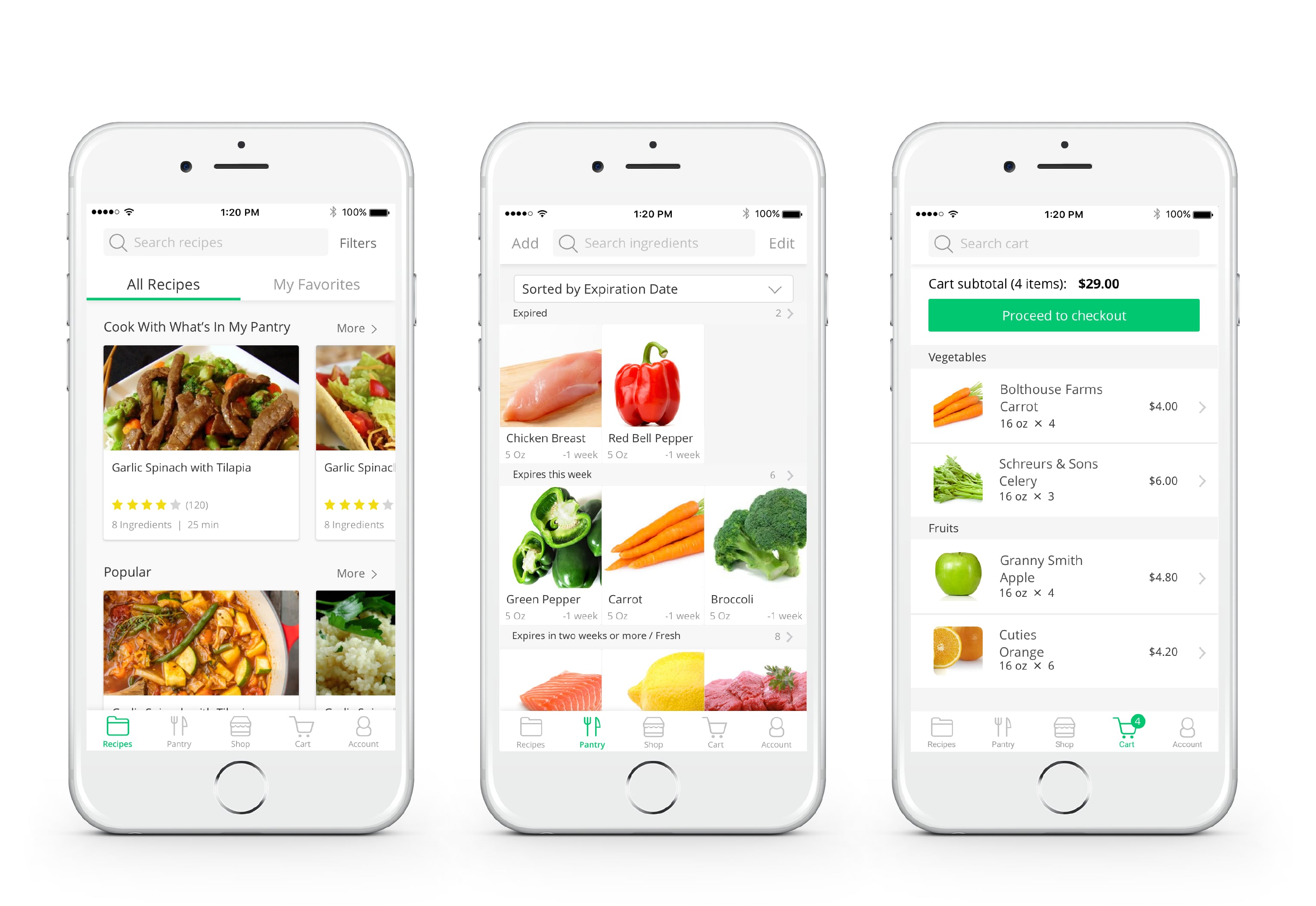
new design of navigation

Introduction

  • Do you desire to eat healthy, but struggle to maintain these habits?
  • Do you often stuggle with having limited time to grocery shop and search for recipes?
  • Have you wasted a lot of money on food that goes bad?

We’ve used all that we’ve learned from the UX research to redesign the Nutritious Grocer from the ground up. It is an app that allows people to search for healthy recipes, buy food related to those recipes online, and track what’s in their kitchen. Inside are handy navigation, carefully crafted filters, helpful directions, intuitive pantry, and new ways to find your next favorite recipe. This is a new app that transforms how you cook.

busy mom Carley
Caring Carly is a busy working mom who wants to cook quick healthy meals for her husband and 2 young kids who are very picky eaters. In this scenario Carly’s challenges are inspired from real data we gathered during our user research.

Now I'm going to walk you through Carly’s journey using Nutritious Grocer, comparing the client’s original web prototype to our new app design. This is the original web prototype created by our client, and I first want to give a high level overview of what Carly can do on Nutritious Grocer:

icon recipe 1
Find Recipes to Cook

She can find recipes that she currently has all the ingredients for

icon recipe 2
Shop for Recipes

She can search all recipes in the database

icon pantry
My Pantry

Carly can keep track of all the ingredients she currently has in her kitchen

icon cart
My Cart

She can add some ingredients to her cart, purchase them online, and pick them up in the store
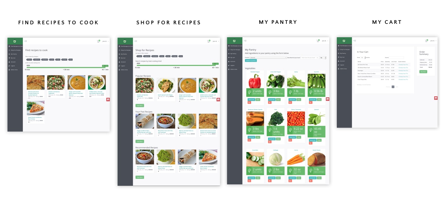
old navigation

Before vs After: Find Recipes

Problems: Confusing nav bar & Limited filtering system

Caring Carly is a busy working mom who wants to cook quick healthy meals for her husband and 2 young kids who are very picky eaters. In the following scenarios Carly’s challenges are inspired from real data we gathered during our interviews, surveys and usability testings.

Let’s imagine Carly just came home from work. She didn’t have time to go to the grocery store but wants to cook her family a healthy meal, so she has to use ingredients she already has at home. However, she runs into some problems:
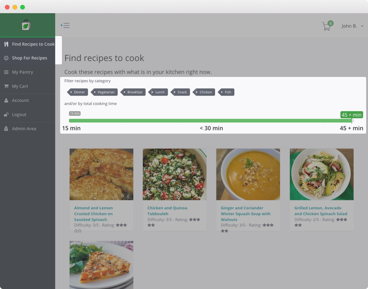
  • Confusing Nav Bar
    First, she has a hard time differentiating between "Shop for Recipes" and "Find Recipes to Cook", and it is not immediately clear where she can find recipes to cook with the ingredients she has in her pantry.
  • Limited Filtering System
    Additionally, she is frustrated that she cannot find specific types of recipes due to the limited filtering system.
old  recipe

Search for Recipes. Better in multiple ways.

  • Clear Nav Bar
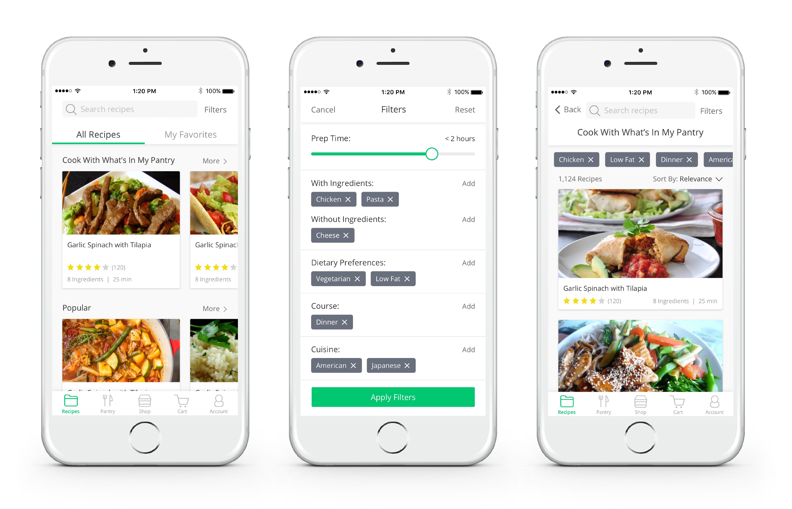
    In order to optimize the experience for Carly, we decided to consolidate all the recipes into a single page. We divided it into sections, the first being "Cook With What’s in My Pantry", clearly communicating to Carly where she can go to find recipes she has the ingredients for, which is a main feature of the platform.
  • Flexible Filtering System
    In order to make it easier for Carly to find the specific type of recipes she is looking for, we designed a flexible filtering system where Carly can easily add and delete a variety of filters, which then show up on the recipes search page so she always can see the filters that are currently selected.
new design of navigation
Tip: hover to see hightlights.

Problems: No Visual Hierarchy & Confusing Botton

When Carly is preparing for cooking for recipe, she’s facing some problems with the current page:
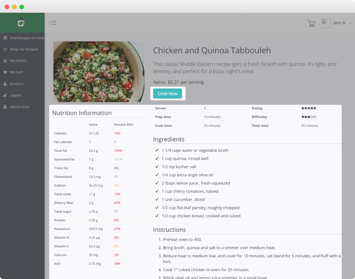
  • No Visual Hierarchy
    There is no visual hierarchy in displaying the information, so she has no idea about where to look first.
  • Confusing Button
    There is a “cook now” button for users to update the pantry. However, carly has no idea so what this button does so she has to go to the pantry page and do manual update.
old individual recip

Recipes. Get to the info with fewer taps.

While optimizing the product for mobile, we also add some new features.
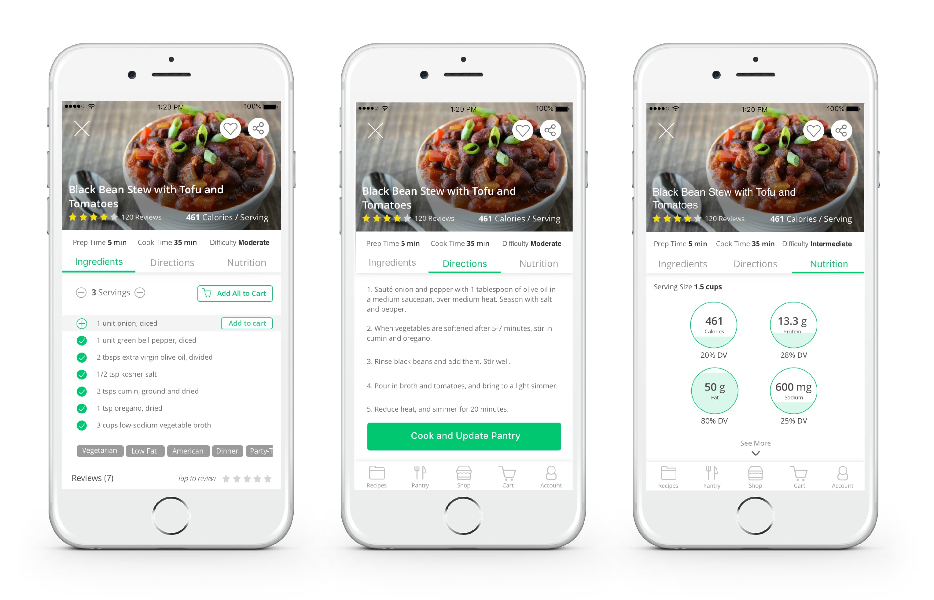
  • Adjust Numbers of Servings to Cook for a Family
    Based on our survey, we found that people cook for various number of people. In our new design, Carly can adjust the number of servings based on the number of people she cooks for, so she knows how much ingredients she need to cook for her family.
  • Handy Tabs to Minimize Scrolling
    All the information is separated into 3 tabs, so she doesn’t have to worry about doing too much scrolling when she gets her hands dirty in the kitchen. Only by one click or swipe, she can find the information that she’s looking for.
  • Unambiguous Button
    We also replace “Cook Now” with “Cook and Update Pantry”. By clicking on “Cook and Update Pantry”, all the ingredients that she used for cooking will be removed from the pantry.
new design for individual recipe
Tip: hover to see hightlights.

Before vs After: Manage Pantry

Problems: Too much scrolling & No expiration date

Later in the evening, after Carley has enjoyed the dinner with her family, she wants to prepare for tomorrow’s dinner. She wants to cook the items that would expire soon but she comes across some problems of the current website.
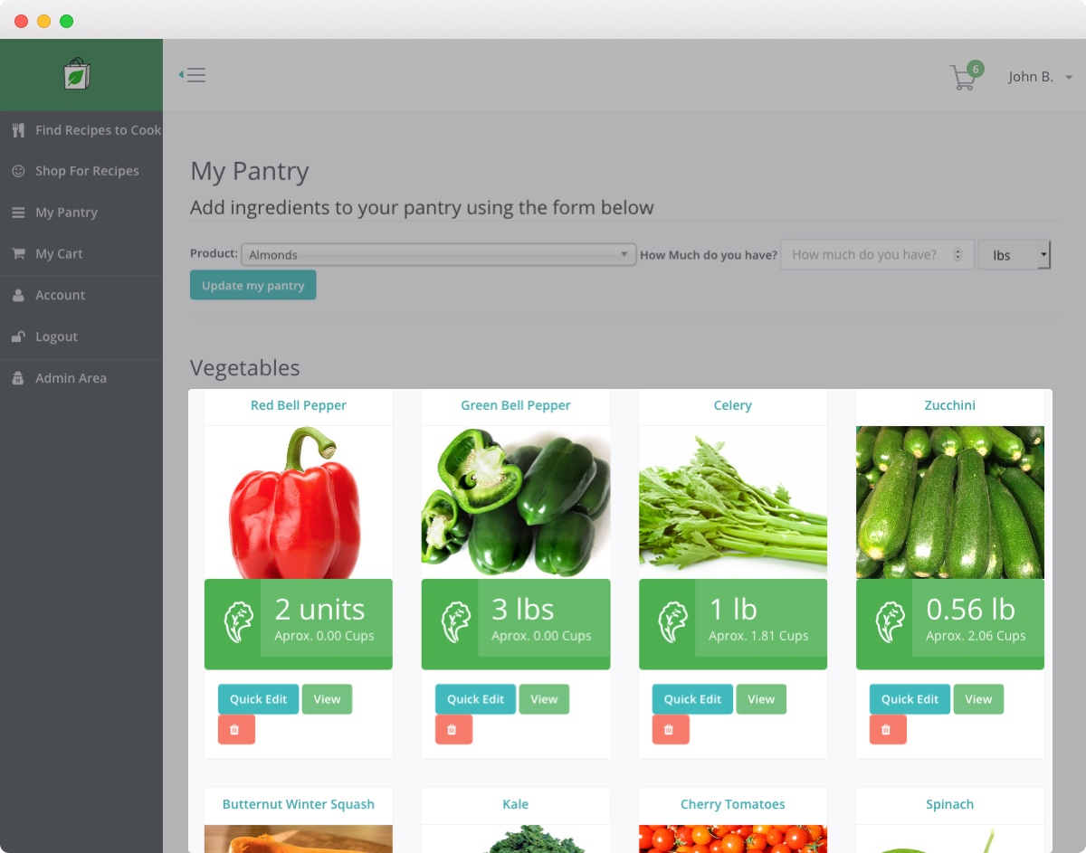
  • Too Much Scrolling
    Firstly the images of the items are so large that it’s cumbersome for her to locate a specific item. This insight is based on our usability testings that many people complained about too much scrolling on the pantry page.
  • No Expiration Date
    Moreover Carley would easily forget about which item would expire soon because there’s no expiration date on the main pantry page. This contradicts with our findings of interviews that many people expects to have more control of pantry items.
old pantry

Pantry. Manage at your fingertips.

To help Carley keep track of what’s in her pantry, we drew inspiration from several pantry management apps in our competitor analysis.
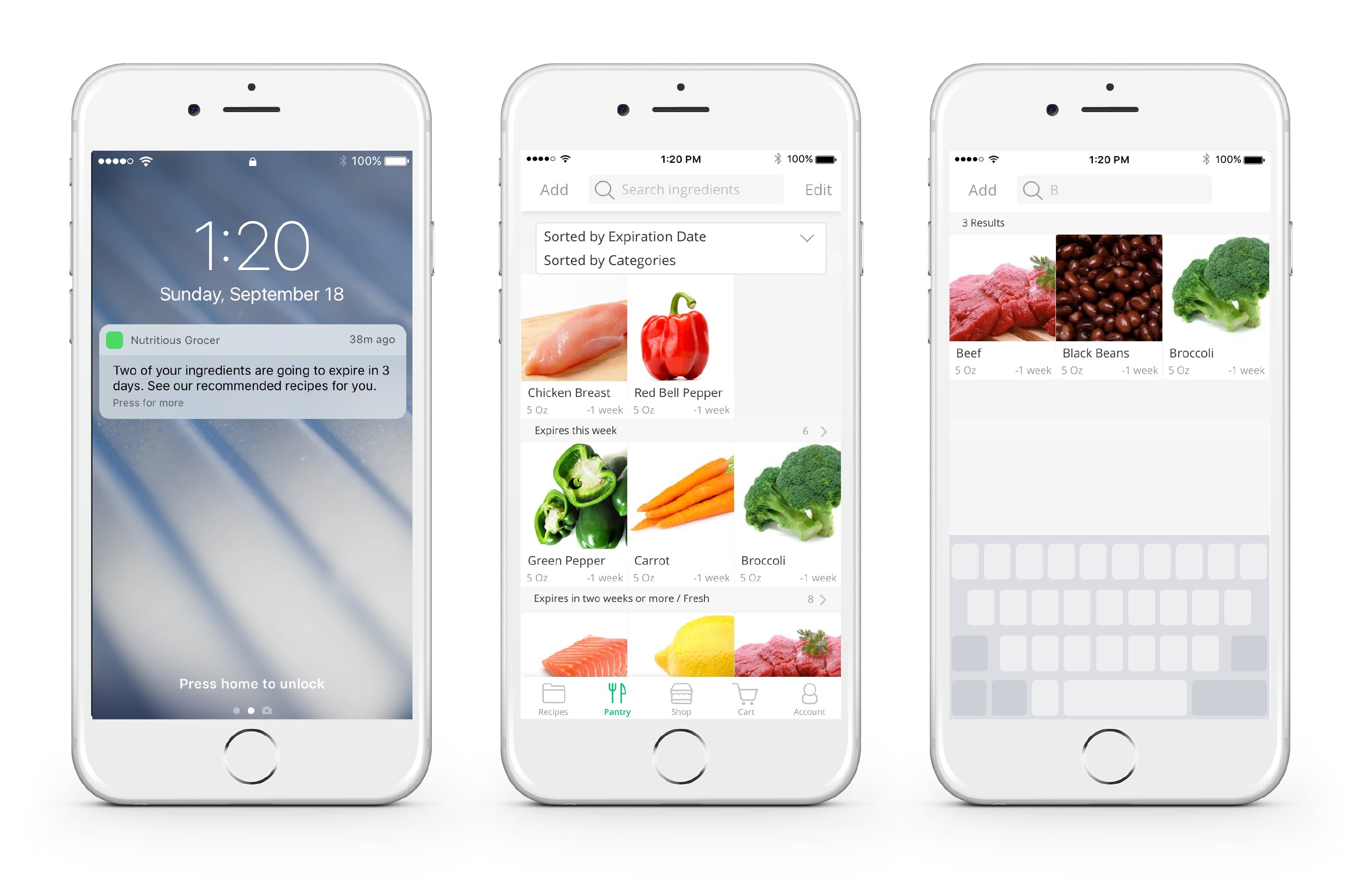
  • Notification to Get Instant Reminders
    Now Carley receives a notification that reminds her the ingredients that would expire in 3 days. There’s no worry for her to forget about the expiration date anymore.
  • Sort Items Easily to Minimize Scrolling
    After Carley opens the app, she can sort the items either by expiration date or by category. All the items are listed in an appropriate size. She could also search the item directly in the search bar. No scrolling effort anymore.
new design for pantry management
Tip: hover to see hightlights.

Problems: Useless graphs & Overwhemling nutrition info

In the past, when Carly used the pantry item page, she found it difficult to interpret the graphs and find basic/high level nutrition information for that item.
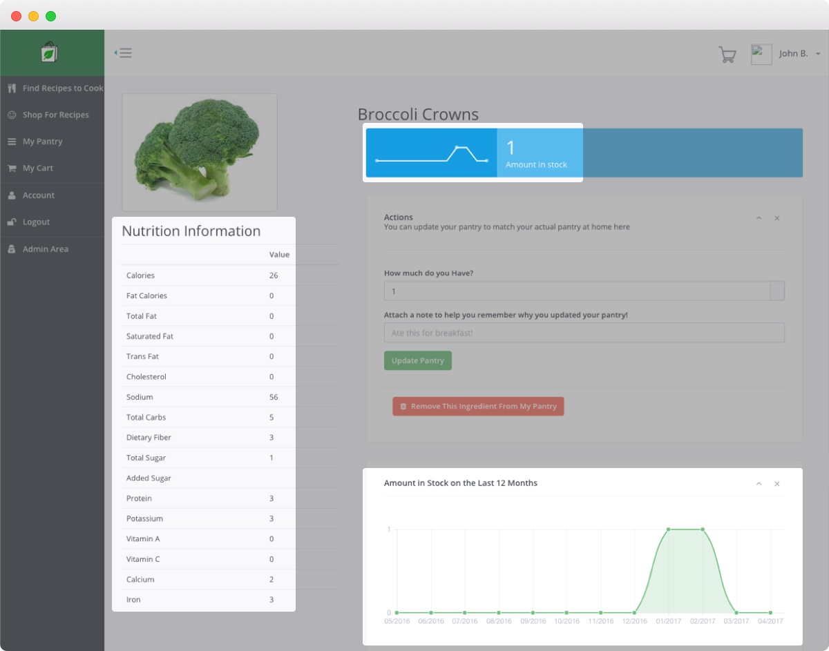
  • Useless Graphs
    The graphs, which show her purchasing history of that item, weren’t particularly useful to her.
  • Overwhemling Nutrition Info
    The nutrition information was also a bit too detailed. She wanted something simpler.
old pantry

Pantry Items. Steamlined than ever.

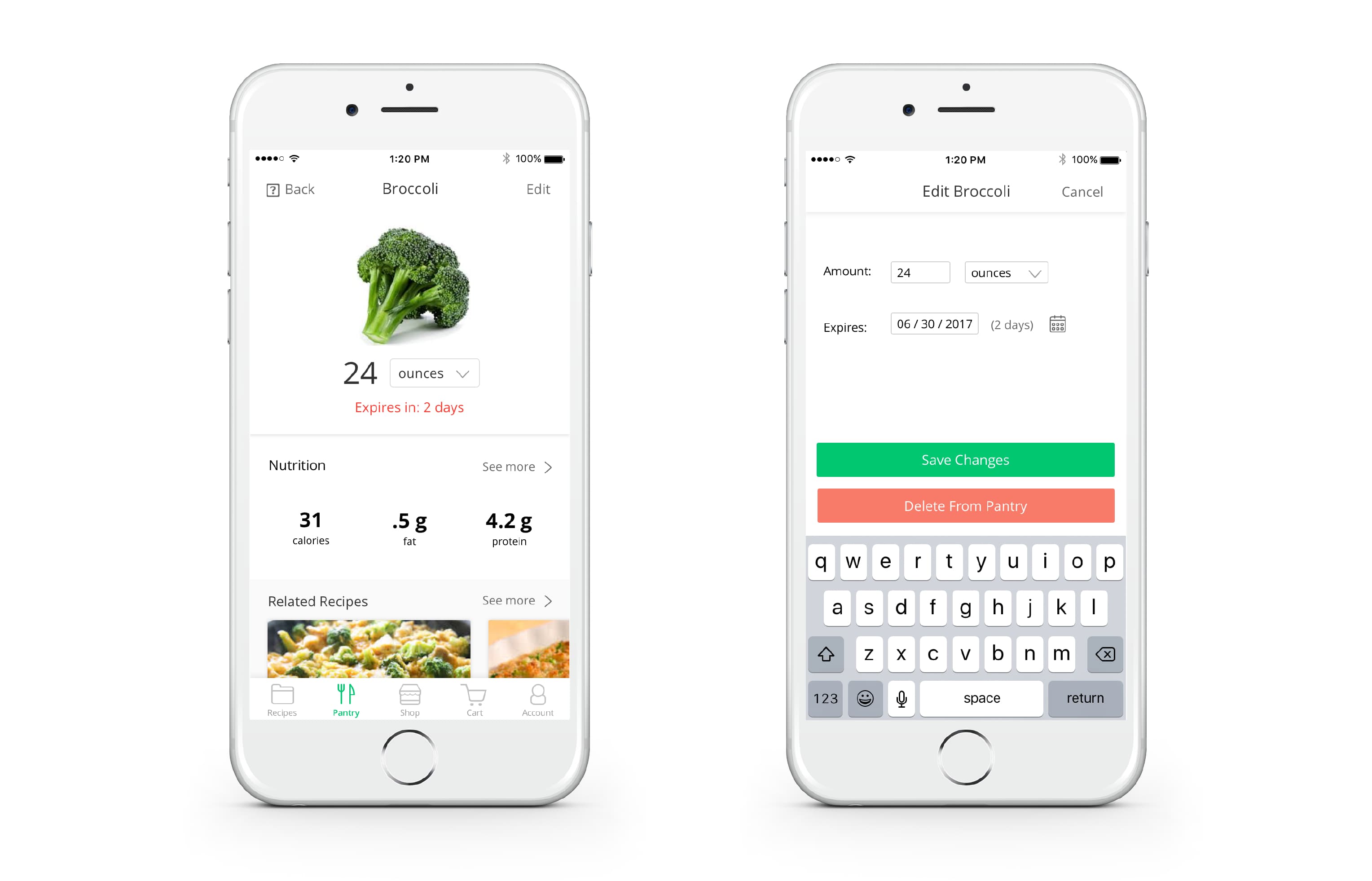
So, with the new design, Carly has a more streamlined experience:

  • Key Info First
    A pantry item’s quantity and expiration date are now prominently displayed, no longer competing with the confusing graphs. The nutrition information is more high level.
  • Recommended Recipes
    Several participants from our user interviews also expressed problems with falling into ruts of cooking the same thing over and over again. To help these users avoid such ruts, we added a section on this page of recommended recipes that include that pantry item ingredient.

Carly decides she wants to cook the broccoli before it goes bad, so she clicks on the recommended recipe.
new design for pantry item
Tip: hover to see hightlights.

Before vs After: Check Out

Problems: Unintuitive delete interactions & Redundant price columns

Carley discovers that she’s missing a few ingredients. She adds them to her cart and prepares to check out.
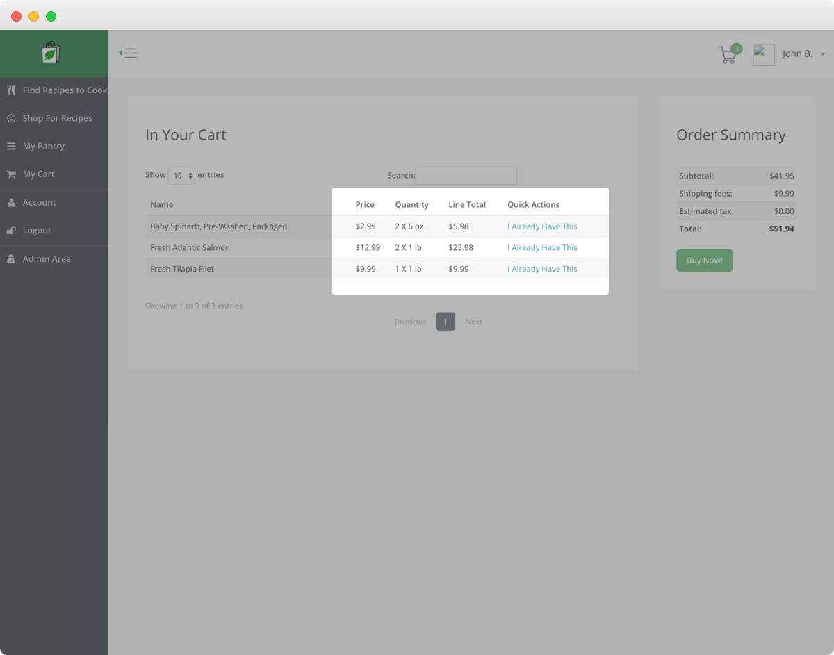
  • Unintuitive Delete Interactions
    In the original design, when Carly goes to her Cart, she is unable to edit the quantity of the items she wants to order. Removing an item from her Cart is also not a very clear process to her either.
  • Redundant Price Columns
    In addition, she finds that having 2 price columns are unnecessary as she mostly cares about the total price she is going to pay.
old cart

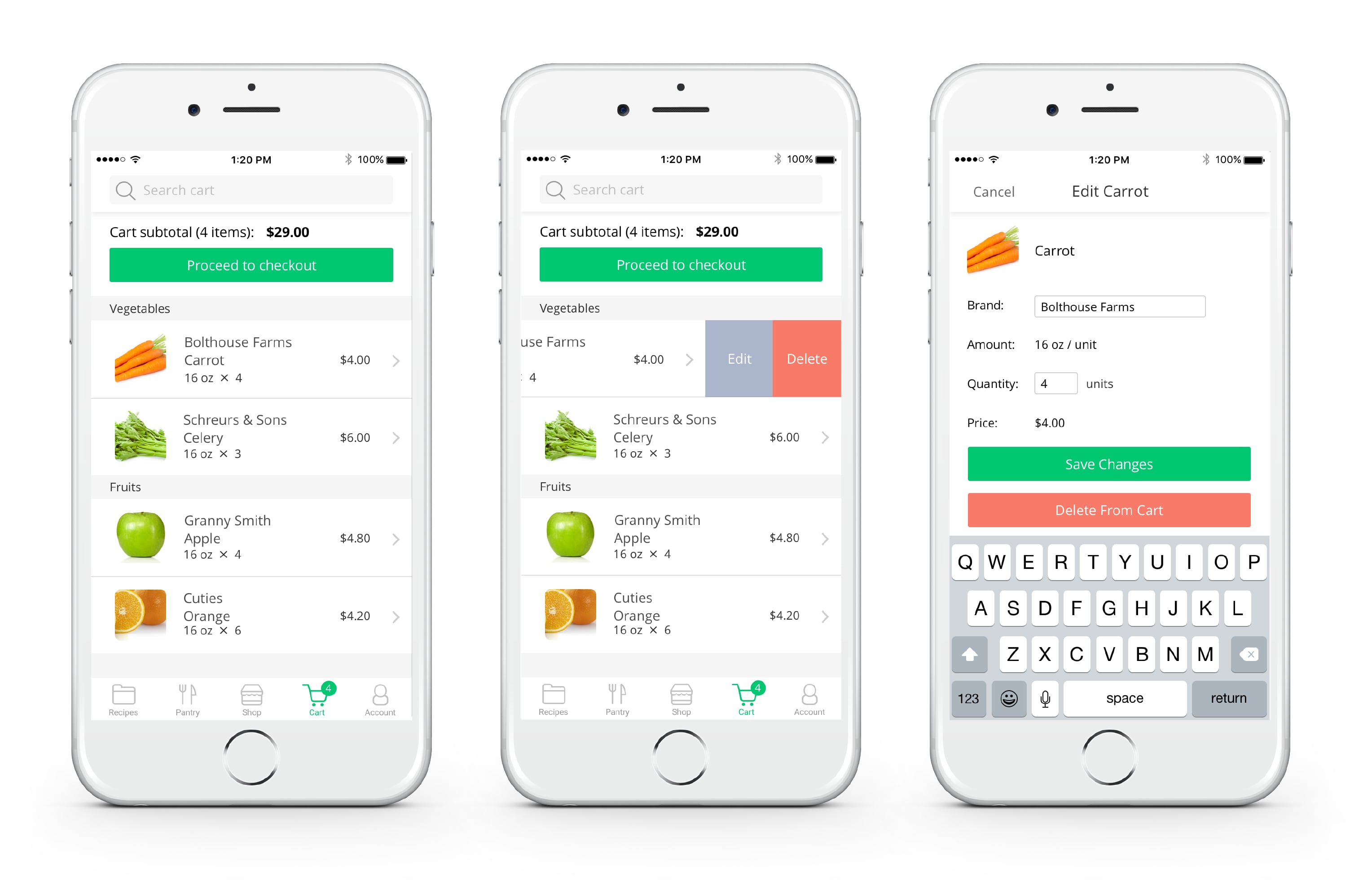
Cart. Bottom line, check out as quick as a flick.

To make this process more efficient for Carly, we drew inspiration from Amazon and other competitors:

  • Swipe to Delete
    We added a common iOS feature, where Carly can swipe over an item in order to quickly edit the item’s brand or quantity or remove it from her Cart.
  • Brands matter
    We also added the ability to change brands to meet Carly's family needs based on the interview findings.

Once Carly is satisfied, she can purchase her items by selecting Proceed to checkout and can later pick them up at the grocery store and cook her family a delicious and nutritious meal.
new design for cart
Tips: hover to see hightlights.

Final Thoughts

Refecting on the whole prcess,the most essential piece that we agreed to solve for was a mobile design, which we decided on after doing some user interviews and surveys. This research validated our assumption that users would usually engage with the app in the kitchen on their phone.

Our research and design process was thorough and comprehensive. One stage that we found particularly useful was the Ideation stage, during which we scoped the features for the new design by comparing current and envisioned features, and prioritizing that list.

Here are some quotes that we got as feedback from our client. Overall, he was impressed by our level of detail and effort put into design and research, and he thought that we really captured the essence of what Nutritious Grocer is.

"I feel they did a good job capturing the essence of what Nutritious Grocer is. It was a very collaborative process, and I enjoyed engaging with the team, which was a huge resource to really advance Nutritious Grocer far beyond what I could have done on my own." —Client

Level-up

Get feedback for your UX portfolio

Book with Lola