Redesigning Teambition’s Mobile App
I led the redesign of the most visited pages on mobile app. I utilized strategy frameworks, defined key metrics, discovered core actions, pitched the ideas, and shipped a polished design.
I led the redesign of the most visited pages on mobile app. I utilized strategy frameworks, defined key metrics, discovered core actions, pitched the ideas, and shipped a polished design.
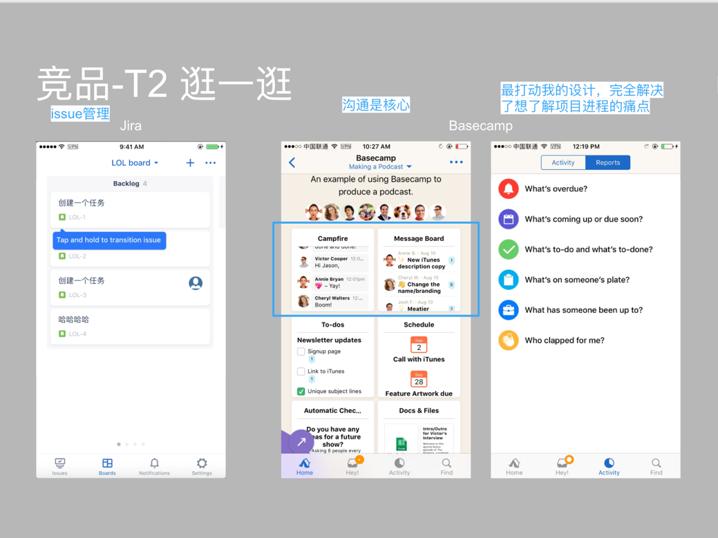
Teambition is a Chinese project management platform that makes it easier for teams to track their work with efficiency. Some similar products are Trello, Basecamp and Asana.
Starting late last summer, I received an ambitious project to improve the mobile app retention. As you might imagine, breaking down this daunting goal can pose some unique challenges.
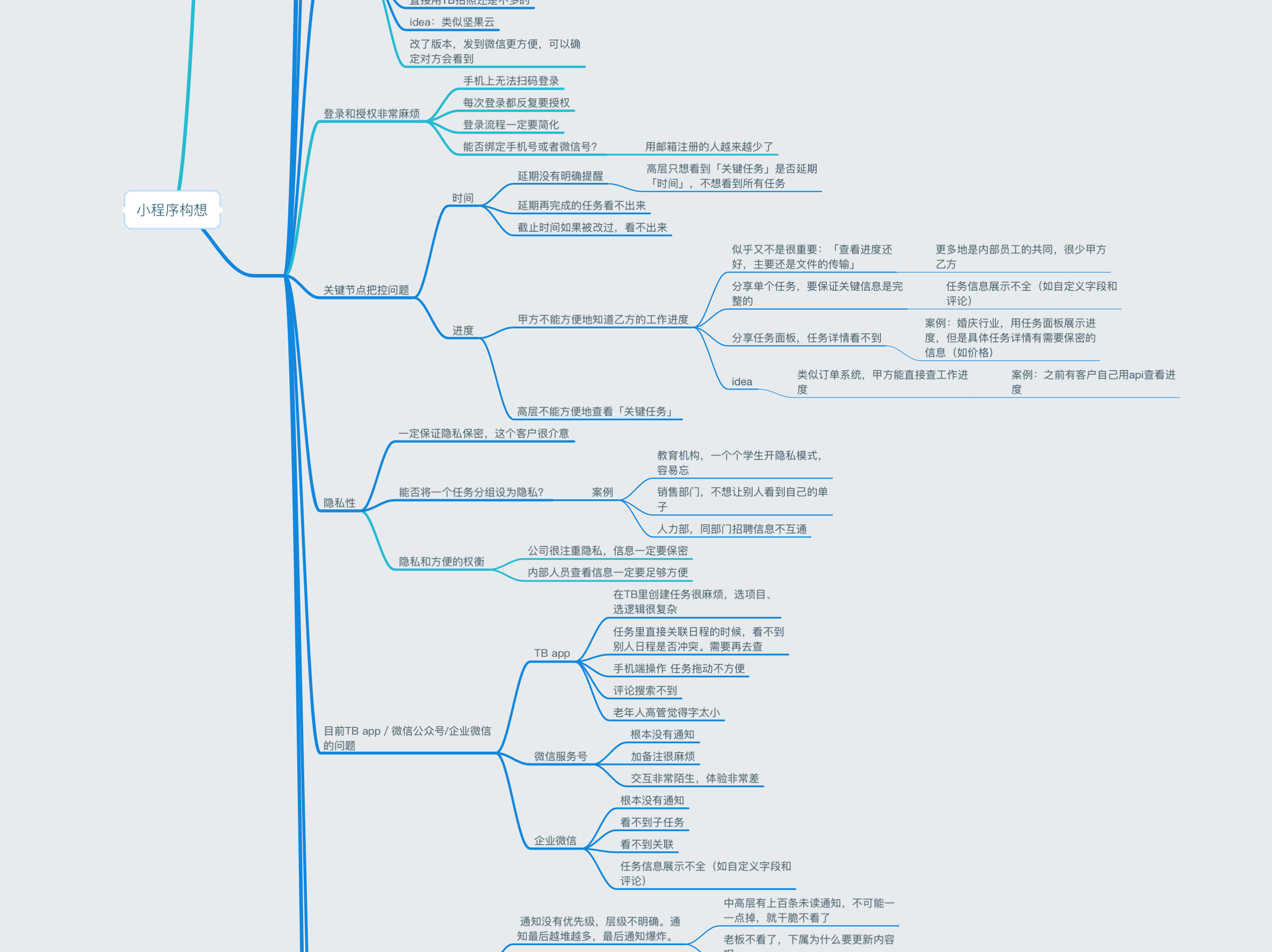
I came across three main challenges:
Before this project, I had no idea how to improve mobile app retention. So I read a bunch of growth articles. Specifically, I drew inspiration from Andrew Chen and Sarah Tavel.
Teambition is a nimble startup, so I had a great opportunity to continuously persuade CEO why it’s a problem and how to solve it. As a design intern, it was not an easy task, so I took a two-step approach:
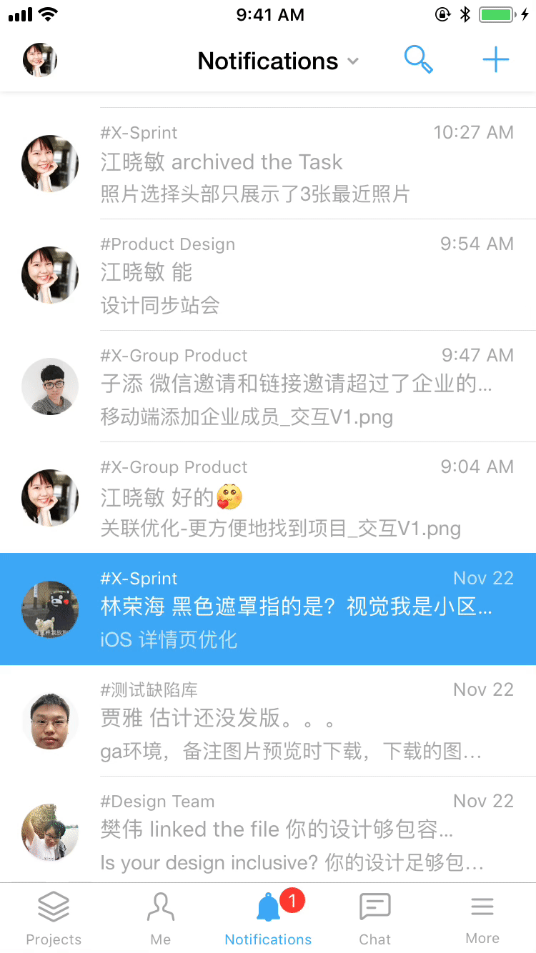
Traditional user research methods such as interviews and user testings are not valued enough here. I guess it’s because the designer-centered culture encourages more of heuristic evaluations and internal dogfoodings. I used some quick and dirty research methods as workarounds. I found three methods extremely helpful to gather insights:
Scroll down to learn more about how I integrated research into design process.
"...where I see that most of the leverage in improving these retention curves happen in how the product is described, the onboarding flow, and what triggers you set up to drive ongoing retention." - Andrew Chen
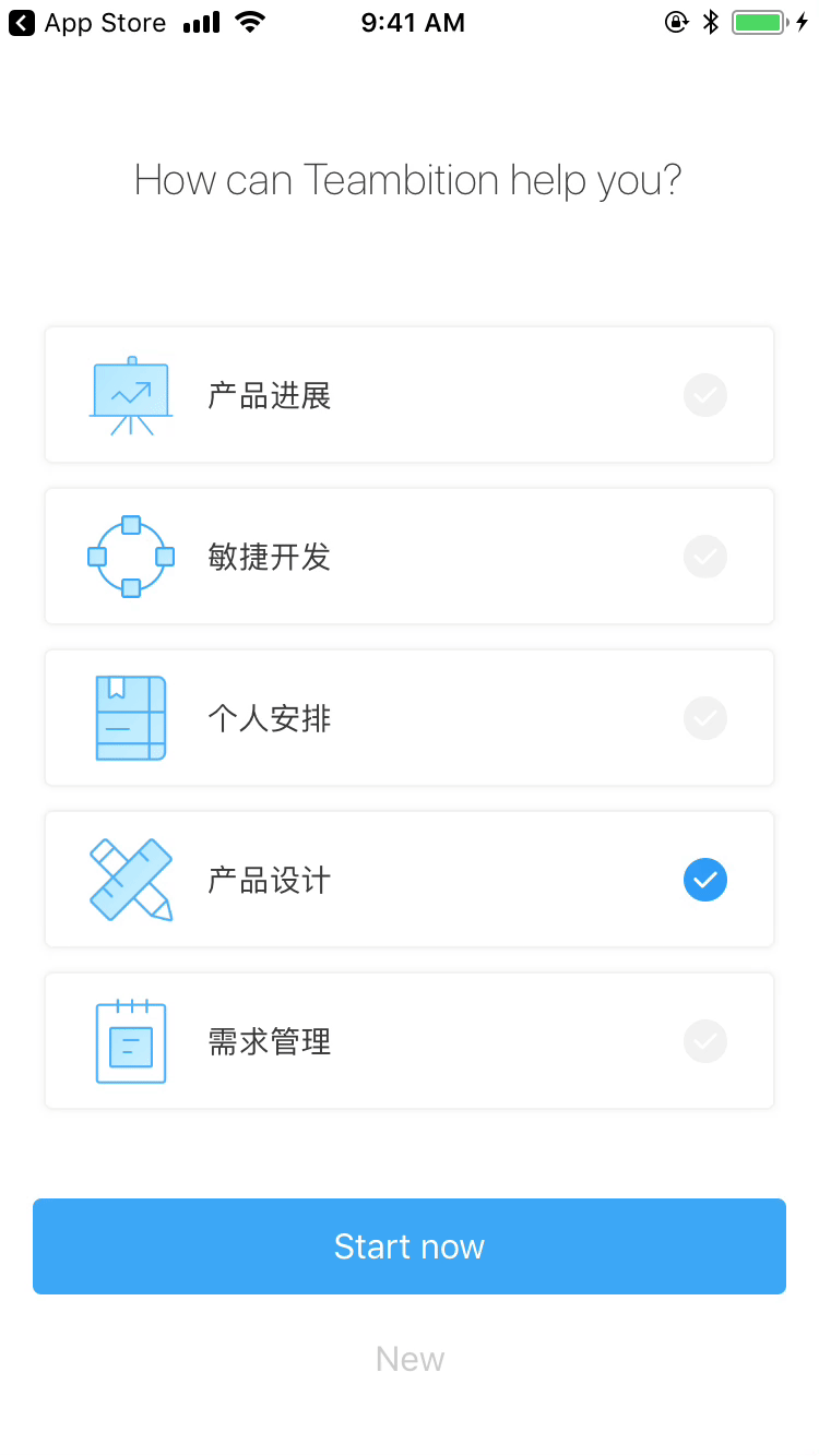
With the first-time user experience in mind, I focused on three key touchpoints for new users to discover our product value as soon as possible:
One area I wanted to improve was onboarding. I wanted new users to create projects and take advantage of benefits to track the progress. But even creating projects is burdensome for new users.
So in the new design, I encouraged users to pick some templates out of six most popular project templates. I also added a transition from creating a project to creating a task so users don’t need to wonder what the next step should be.
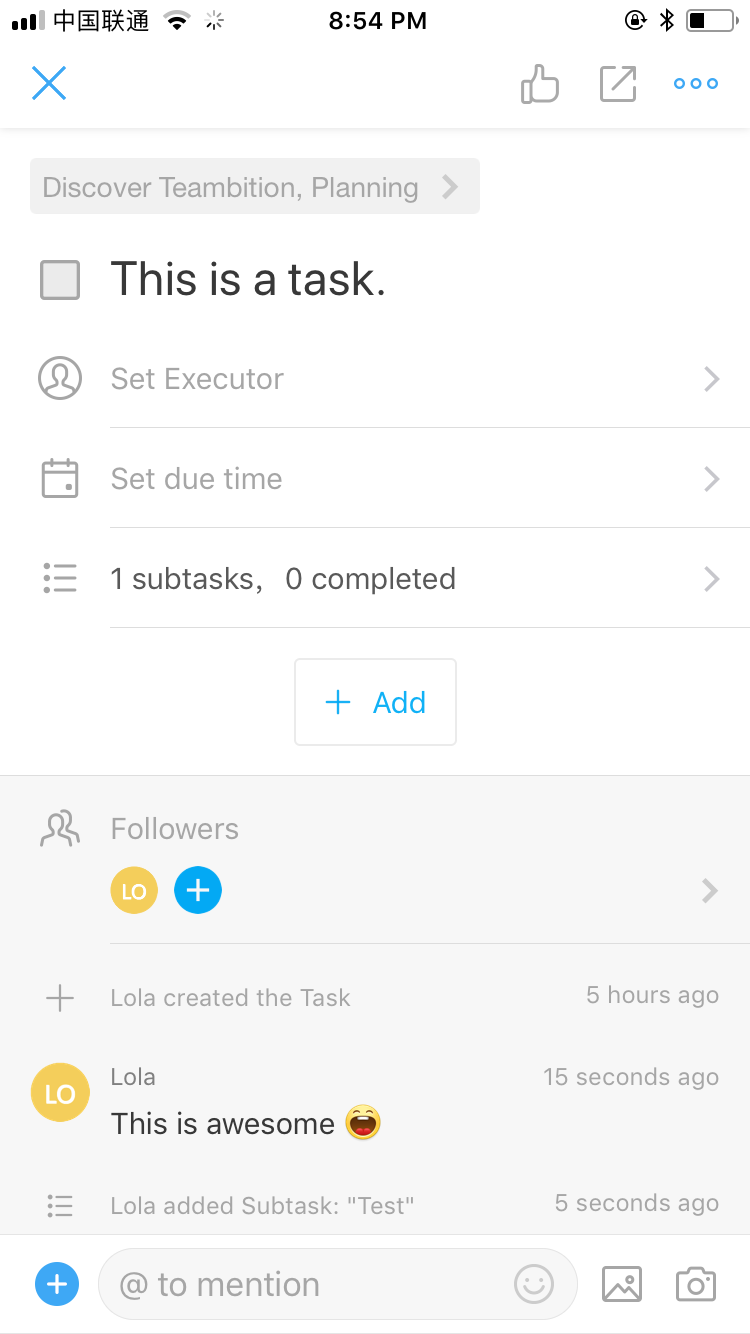
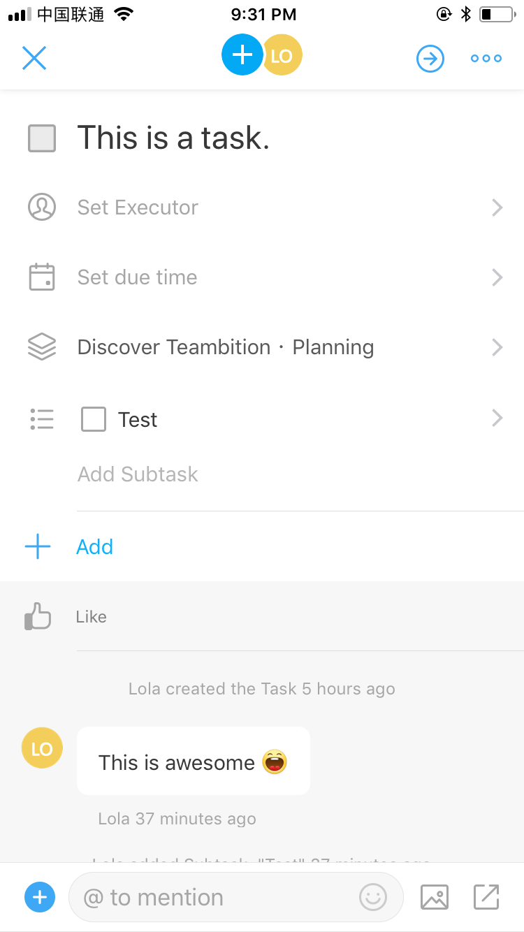
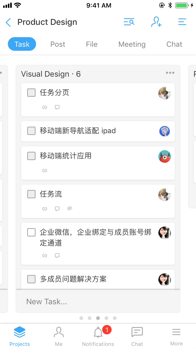
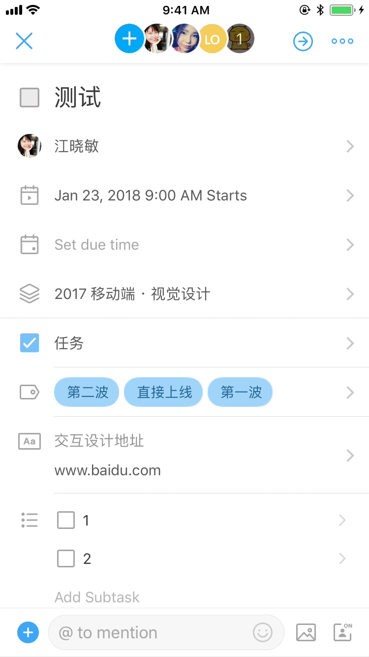
Task is the most important piece to our product. The existing design was cluttered and users felt like they had to enter a lot of stuff.
In the new design, I highlighted one essential piece, title, with more white space in addition to de-emphasizing other less important text fields.
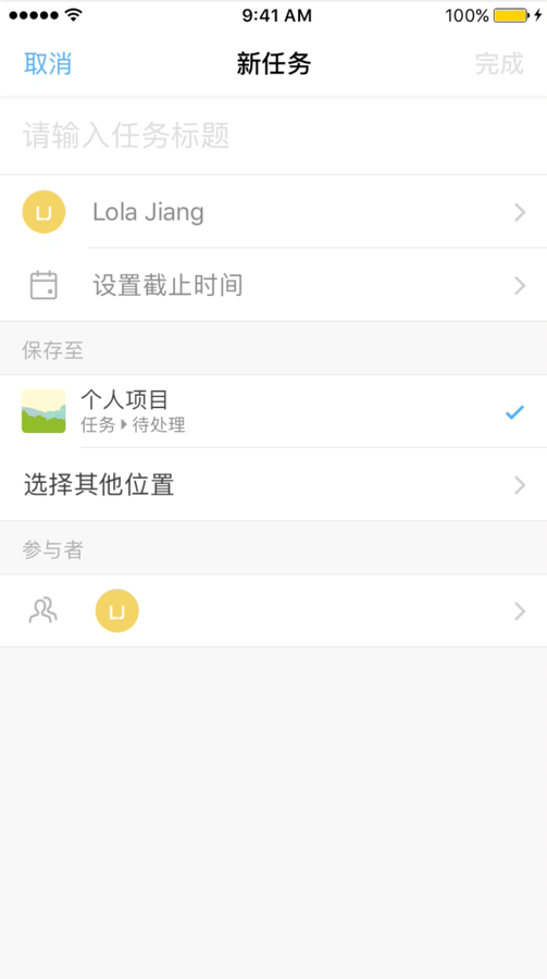
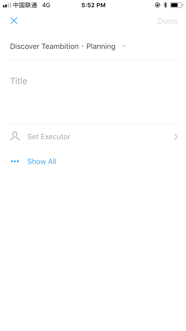
For a project management platform, task is everything.
"What matters is not growth of users. It's growth of users completing the core action." - Sarah Tavel
I unpacked the concept of retention based on Sarah Tavel’s engagement framework and narrowed down to four core actions I would encourage new users to do:
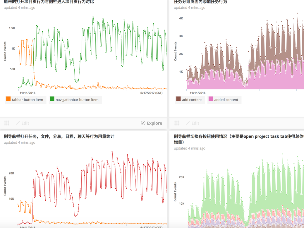
I partnered with our data analyst and used data to justify those four core actions. Users who did those four core actions have significantly higher retention rate than users who didn’t.
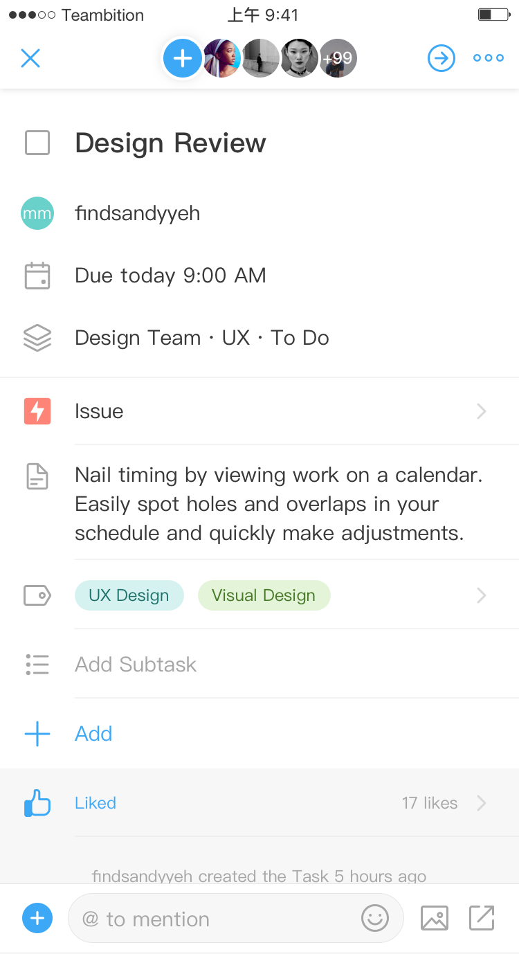
I’d like to talk more about Task Details Page in detail. Not only because this is the one I put the most effort into, but also because I learned how to design under constrainsts.
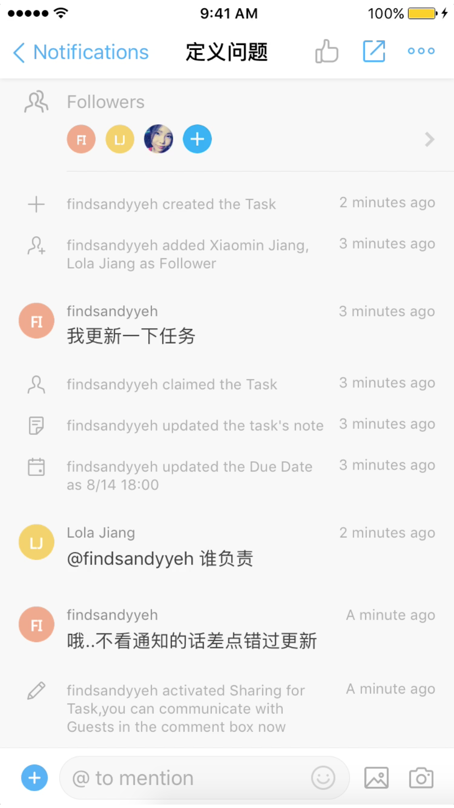
During heuristic evaluation, it was confusing even for me to figure out what “Read Only” (Visitor) mode was and what differences were between several modes of permission.
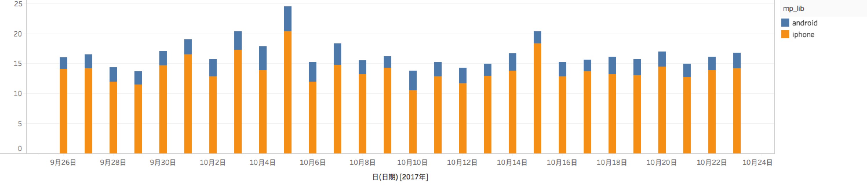
Data also validated that. Only 16.7% people shared successfully after they hit the sharing button on mobile. Something must be wrong with the sharing.
I did several rounds of iterations. The first iteration mainly focused on the wording. I also changed the order of sharing methods based on relative usage frequency.
Obviously, that was far from enough. Not until I discussed with customer success manager for customer complaints did I discover the tradeoff between privacy v.s. convenience.
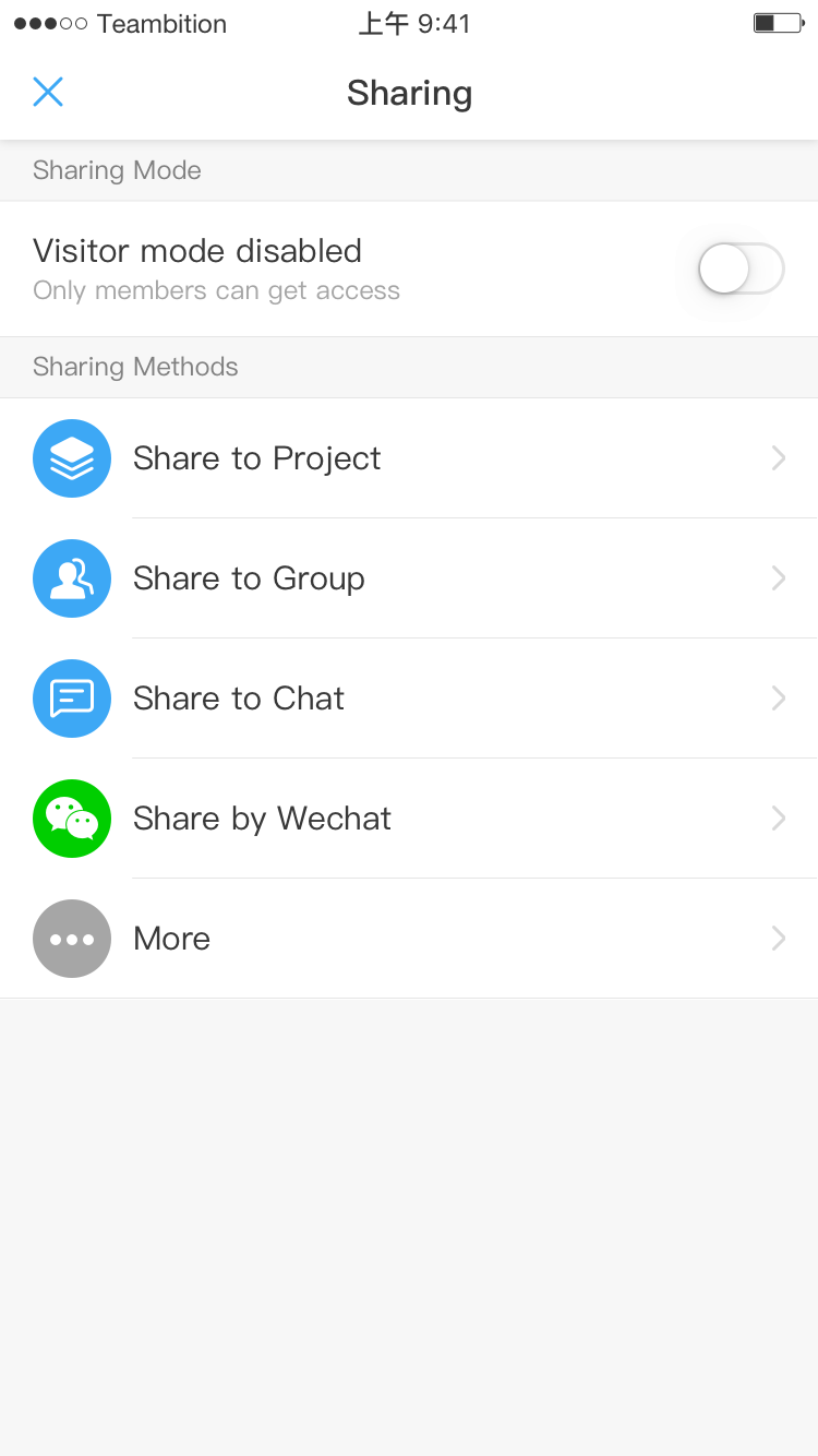
This insight opened a door of new possibilities. The new design allowed users to share without toggling the “Visitor mode” button on, i.e. they can share tasks to their colleagues without worry of information leakage.
It also mirrored the existing capability of web users. If users can copy a URL from a browser and send the link to their colleagues through Wechat, why can’t they do the same thing on mobile?
Task is the core piece of our product. Project management without changing task stage, say, from “To Do” to “Work in Progress”, is impossible.
Sounds obvious, but I couldn’t get the engineers to buy in. So I approached our data analyst to ask for more evidence. It worked. Data shows that the average number of events per action is as high as 20 times, much higher than other events such as copying or archiving.
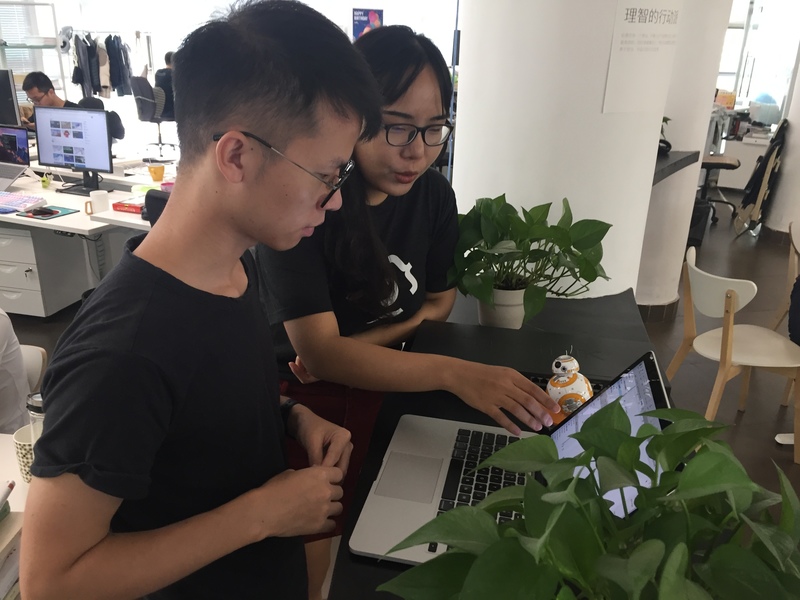
As you can see, one of the most fascinating thing to work in a in-house design team is the ability to work closely with the engineers and convince them of your design decisions.
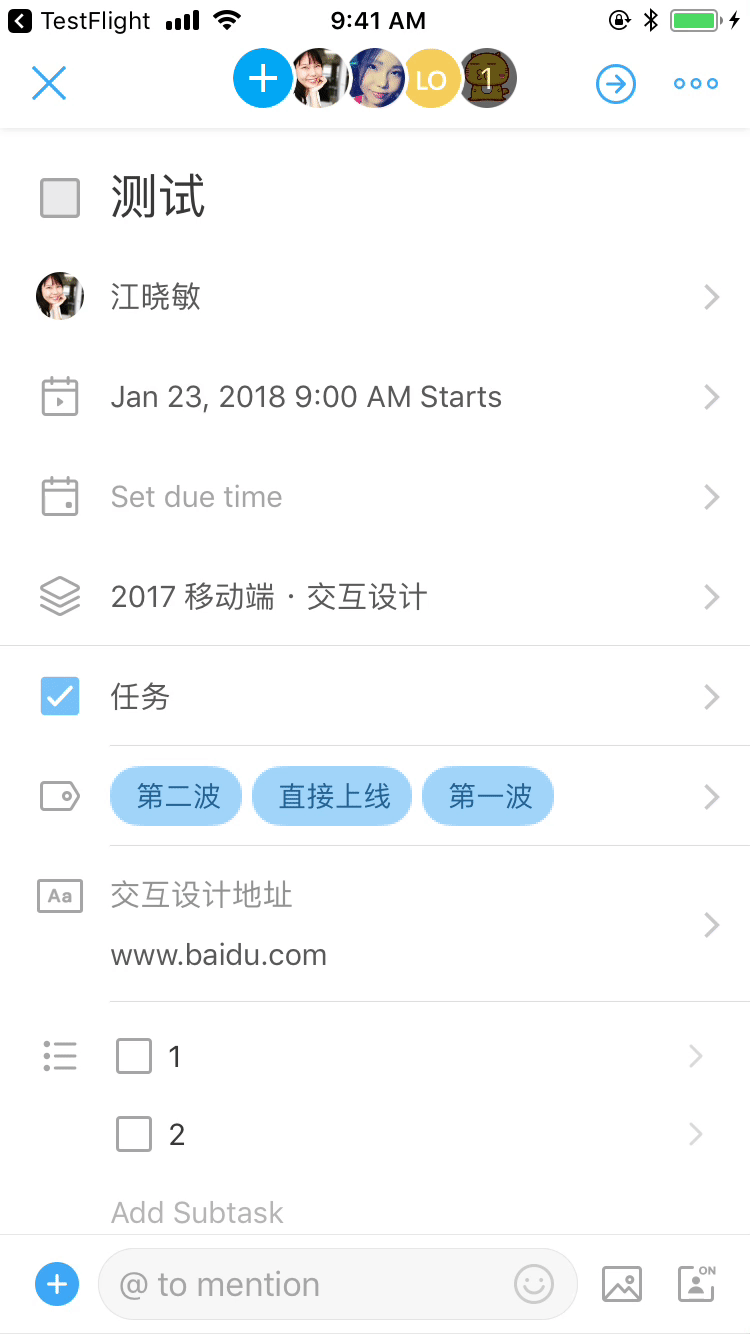
I opted for more obvious call-to-action by moving the button to the upper right corner.
I also reduced the stepes of changing task stages by landing users on the task page page without touching project or task group. This, of course, can save them a lot of headache.
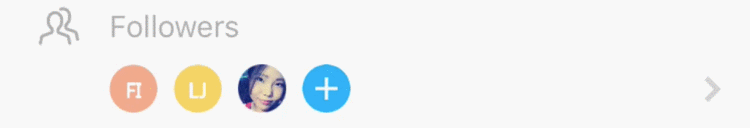
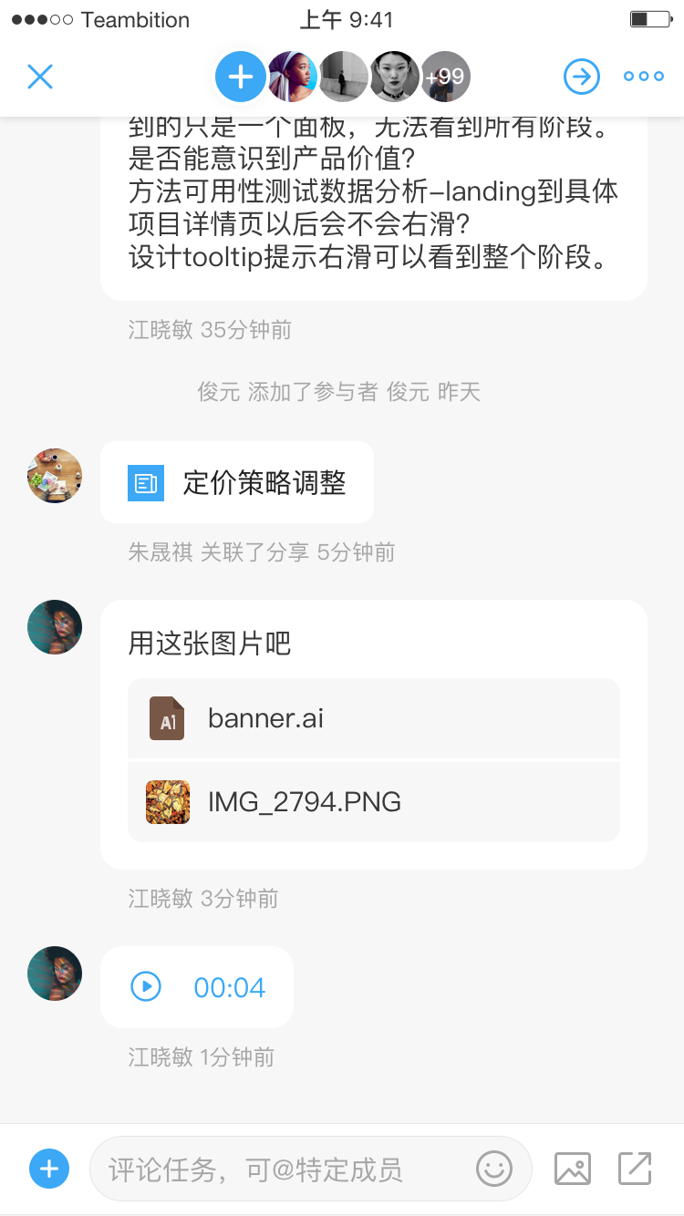
Both inviting colleagues and commenting on a task are low hanging fruits. The goal is to make it more obvious to invite colleagues and make it easier to engage in conversations. I drew inspiration from Dropbox’s header with circle images and Facebook’s new messaging design paradigms separately.
The header with circle images is a more effective call-to-action to encourage people to invite colleagues than a grey cell hidden below the main task
The messaging design paradigms empower people to converse better than message board styles.
Aside from those core actions, I also did a variety of design treatments to find opportunities on improving user experience on task page:
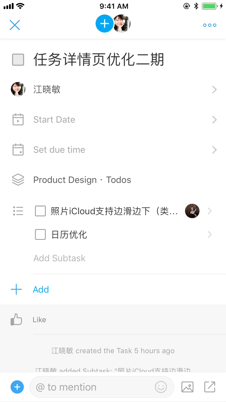
Helped people break up the work by expanding subtasks in a checklist format.
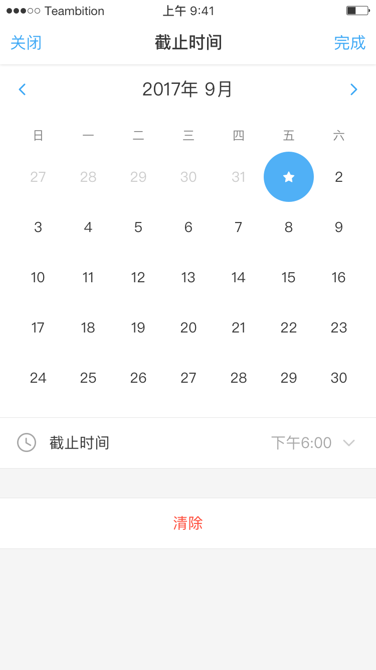
Made the date easier to select by changing from default date picker to a calendar view.
Made the new activities easier to read by scrolling automatically to the bottom of the task page from their inbox.
Improved navigational gestures by enabling people to swipe back out into Task Panel.
Provided a more convenient photo uploading experience by placing recent photos right at the top of menu.
I will validate all the design decisions based on the performance of key metrics such as active users, number of events and retention rates.
The biggest lesson I learned in this internship is the tradeoff between quality and cost. Obviously nothing is ever “done” because there’s always another idea. However, designers have to learn to balance between time, cost and quality constraints.
Redesigning Teambition mobile app has been an incredible adventure so far, and I’m really grateful that I got to work on so many things, and that Teambition offered me a project with a big impact that I would have ownership of.